Product/June 1, 2023
How to Use AI to Generate Ecommerce Product Images

Alfred
Co-founder
This article was written for a previous version of Pebblely.
The interface and features described here may no longer be accurate. Check out our updated guide or latest blog posts for current information.
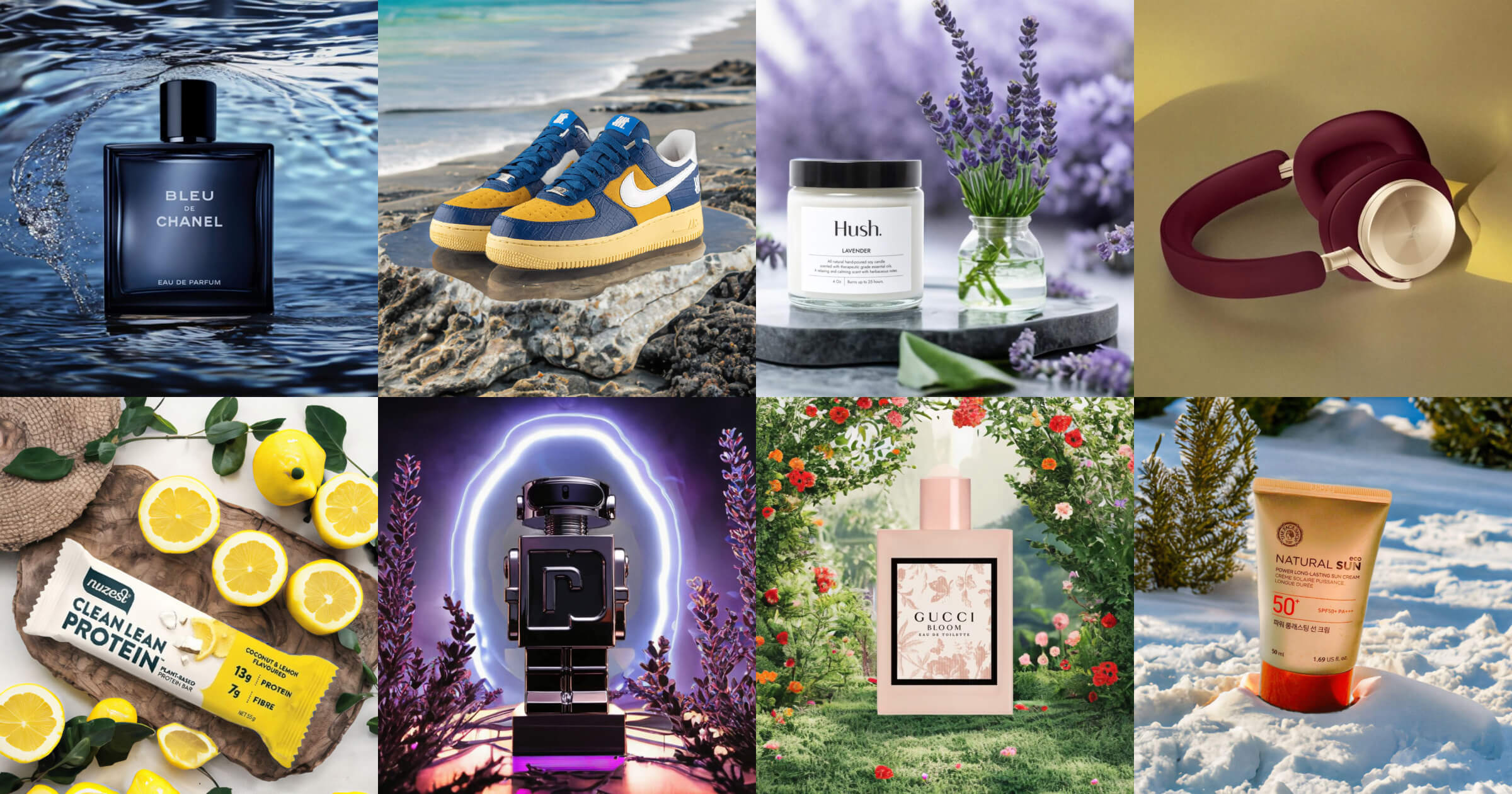
AI is changing product photography. Here’s how you can leverage AI to generate marketing assets that build your brand and sell your products.
Professional photoshoots are expensive. They can cost thousands or tens of thousands of dollars. Or you can spend hours or days taking photos of your products in different settings yourself. And they still might not look good.
It’s hard. I went through the pain when I was running my notebook ecommerce store.

At Pebblely, we are building a tool to empower creatives to generate product images more efficiently and creatively with AI. With a single product image, you can generate unlimited beautiful photos that build your brand and increase conversions.
I will first go through how to use Pebblely and then share tips for generating beautiful images that build your brand and sell your products.
5 steps to generating AI product images with Pebblely
Instead of spending days or thousands of dollars on your product images, you can get them in seconds, at your desk—and at the price of your dinner.
- Take a photo of your product
- Upload your photo to Pebblely and remove the background
- Resize, reposition, and rotate your product
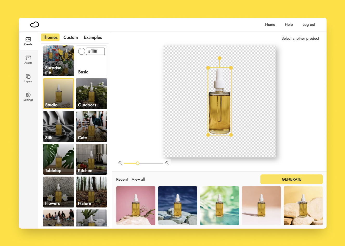
- Pick a theme and generate
- Download your generated images at a high resolution
1. Take a photo of your product
Before you use Pebblely, you need at least one image of your products. If your suppliers already provided you with product images, usually those with a white background, great. You can use those.
Otherwise, you can easily do it yourself. Here are a few quick tips:
- You do not need a professional camera. Most smartphone cameras these days are powerful enough. The iPhone 14 can take as good as or even better photos than my professional DSLR, Canon EOS 600D.
- You do not need to worry about the background or photo composition because you will remove, create, and adjust these with Pebblely later. Just take a few photos of your products from different angles. At most, you could use a sweep to get some photos with a clean background.
- The key thing is good lighting. Generally, you want light shining on the surface of the product you are photographing so that your product wouldn’t look too dark later and your smartphone can capture the details clearly. Natural sunlight often works best.
2. Upload your photo to Pebblely and remove the background
When you upload your photo to Pebblely, Pebblely automatically removes the background for you. You can also finetune the background removal with the brush.
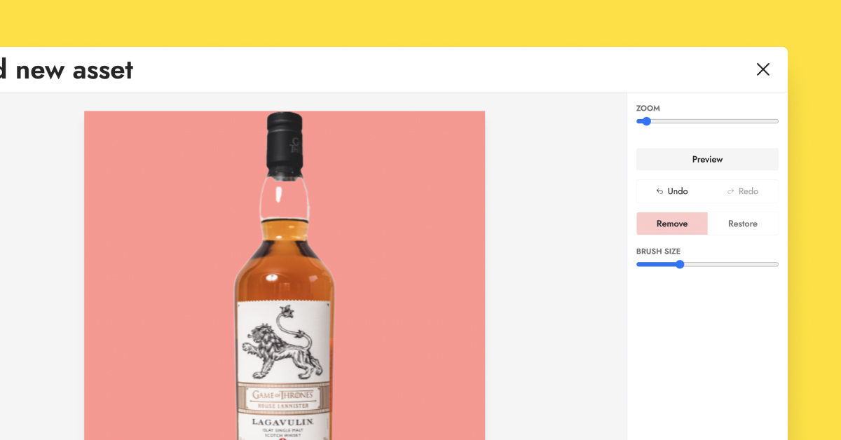
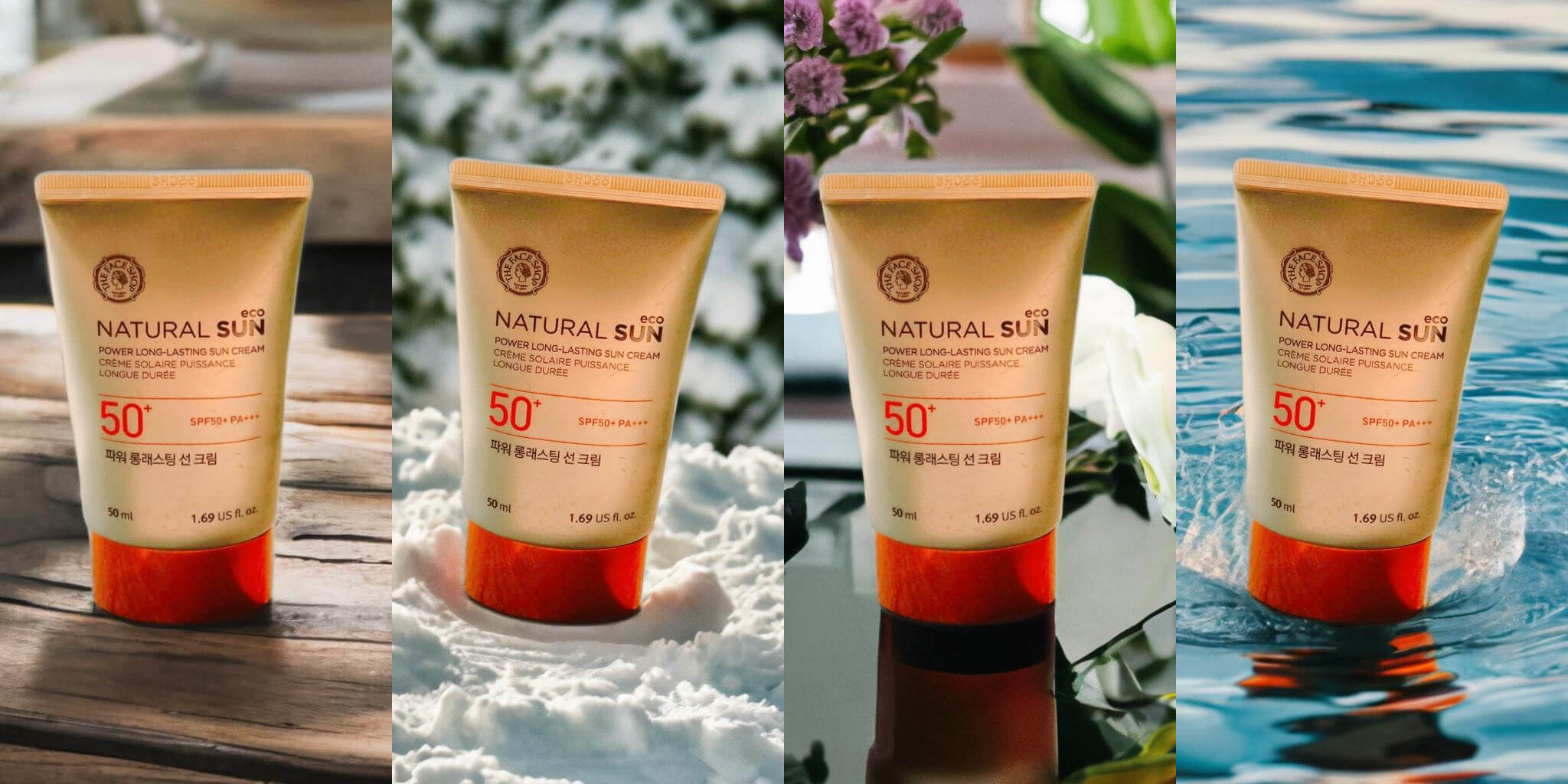
If your products have some transparent parts, remove them so that Pebblely can fill them with a suitable background. For example, I removed the gap between the bottle cap and the liquid while keeping the white reflection there.
Here are the images I generated with that product image:

3. Resize, reposition, and rotate your product
Most product images have the product right in the middle. And that is perfectly fine.
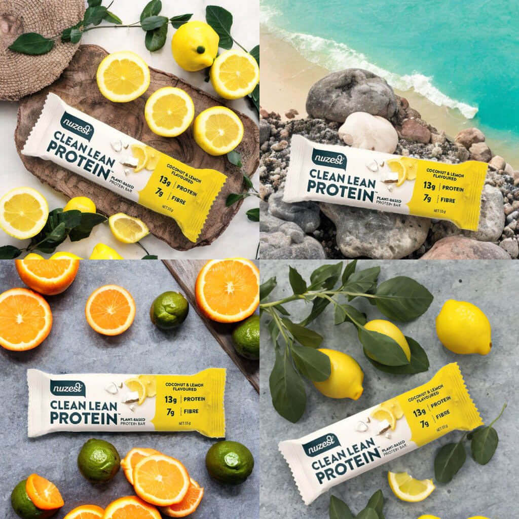
But if you also want to generate images for your social media, ads, and emails, then try different sizes, rotation, and positions when you are generating the images. You can even change the canvas size. This allows you to get multiple different images from a single photo.
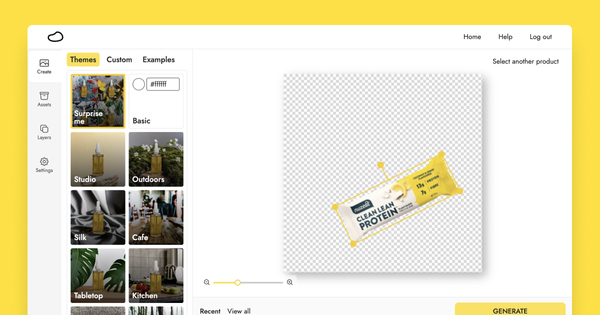
For example, these images were generated from a single image of the Nuzest protein bar:
If you want to generate more complex images, you can add multiple products to your canvas.
In the second half of this article, we’ll talk about how to position your product in photos (i.e. composition).
4. Pick a theme and generate
Here’s the fun part.
We created 40+ themes, ranging from Basic to Studio to Cafe, for you to choose from so that you do not have to rack your brain thinking about how to describe the images you want. Just pick one, and hit “Generate”! And Pebblely will generate four images for you.
(We will be adding more themes, so let us know what other themes you want.)
But if you want a customized background, on the paid plans, you can use your own description and image to generate whatever images you desire. Space, living room, mountains, and so on.
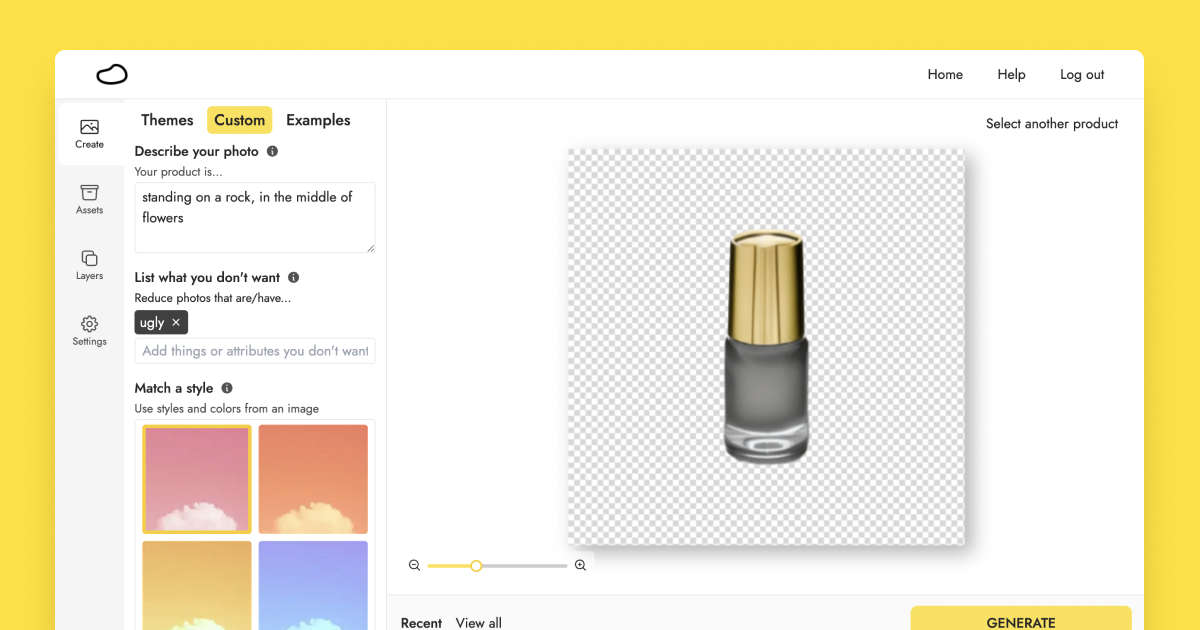
A few tips to get your desired images with a custom background:
- Be specific with your description. If you have something specific in mind, such as “on a white marble table, surrounded by blue flowers”, use that. Otherwise, you can use something vague like “on a table” to see what Pebblely generates for you and then refine from there.
- Use “standing” or “on (something)” in your custom description if you want your product to be standing in the generated images. Pebblely will add appropriate shadows and reflections so that the object blends into the background nicely.
- Remove unwanted objects using negative prompts. If you don’t want something, say leaves, in your generated images, just add leaves under “List what you don’t want” and Pebblely will be less likely to generate images with leaves.
- Use your existing marketing images under "Select a reference" to generate new images with similar styles and brand colors.
We have an entire guide on generating high-quality custom backgrounds.
On the paid plans, you can generate unlimited images. So feel free to keep generating and testing different themes until you get what you want.
5. Download your generated images at a high resolution
By default, the generated images are 1024X1024. If you are on the paid plans, you can download the images at 2048X2048. Pebblely will upscale the images for you so that they are not just bigger but also clearer, especially the text.
Once you have generated your images, you can even edit and resize them.
5 tips for creating beautiful images that sell
While Pebblely can help you create backgrounds for your product, knowing the basics of photography and storytelling helps you make the most of Pebblely to create brand-building and sales-converting images.
1. Think about the story
Creating great visuals starts with storytelling.
- What is your brand?
- Who is your audience?
- What is the context?
- What do you want them to know, feel, and do?
- Where will you use the visuals?
For example, if your brand or product is fantastical, you might want to use illustrations in your images. Or if your audience frequents the beach and uses your product there, you might want to have the sunny beach as your background. Or if you want your audience to feel cozy or cold, you could put your product on a snow field.

A picture tells a thousand words. What is the story you want to tell?
2. Consider different angles and settings
When building a brand, you want to tell a consistent story—over and over again. Your brand is what you do, not what you say.
But that doesn’t mean you should use the same photos with the same backgrounds all the time. Your audience will get bored. Consider Nike. They tell the same “Just do it” story all the time but from many different angles. One example is how they have marketing campaigns with elite athletes but also ordinary folks like you and me. (Well, just me if you are an elite athlete!)
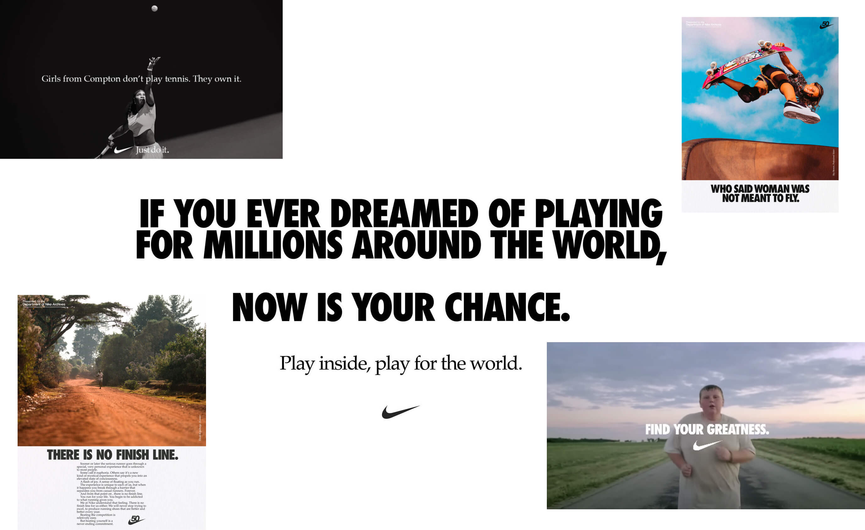
So have photos of your products from different angles—literally and figuratively.
Here are a few heuristics I like to use:
- Where do people use the product?
- What does using your product look like?
- What is the outcome or benefit of using the product?
- What ingredients or materials does the product have?
- What other products do people use together with the product?
3. Blend in your brand colors
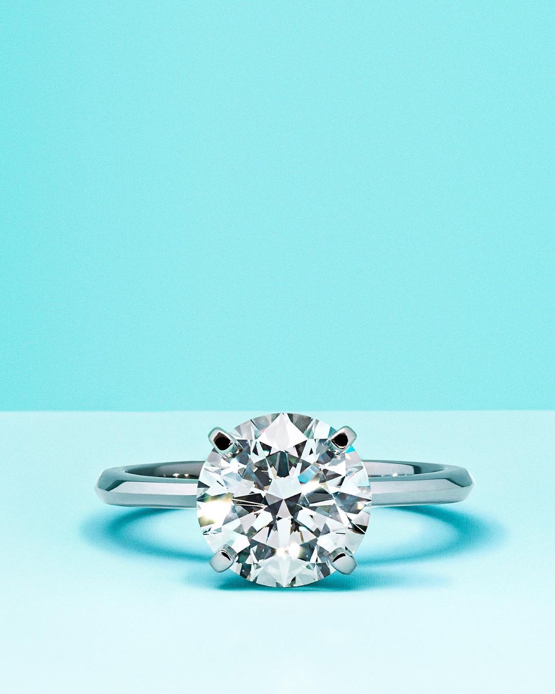
No prizes for guessing this brand.
Tiffany & Co. uses their trademarked color everywhere. Packaging, website, social media, ads, and more. They often use simple colors, such as black, white, and silver, in their visuals so that the turquoise color will stand out. They even use turquoise shadows for their product images. Very creative!

Of course, Tiffany & Co. is an extreme example. But you should still incorporate your brand colors into your visuals to create that consistent storytelling. As mentioned above, you can use your existing marketing images under Select a reference in the app to generate images with similar styles and brand colors.
4. Follow the Rule of Thirds
When it comes to the photo itself, composition plays a huge role. That is where you place your subject in the photo, what you include or exclude from the photo, how you balance various elements, and so on.
A simple trick that photographers use is the Rule of Thirds.
Essentially, draw a three-by-three grid on your photo and place the main subject on one of the intersections or the lines.

This makes the photo more interesting than putting the main subject right in the middle of the photo. And people tend to look at the intersections when they look at photos.
That said, this is just a guide. Professional photographers would often break this rule. Here are some examples that a few pros shared with Adobe:
- Fill the frame
- Pull back from your subject
- Try a different composition style (Notice how the X shape in the last image draws your attention to the person in the middle? The bright yellow jacket on a dull background helps too.)

5. Try the L-space tip
I cannot remember where I came across this tip, and I cannot find it now. But it’s a lazy trick I use the most.
When taking photos, place your main subject such that there is an L-shape space around it. This is kind of like the Rule of Thirds but way easier to remember and apply.

Final tip: The photos are just the start
Having beautiful photos is great. But that is just the first step. Your goal is to use the images to build your brand and sell your products.
So once you have the images, consider whether you should add your logo, tagline, customer reviews, or unique value propositions. Then use them on your website, email, social media, ads, and so on.
On the Pebblely paid plans, you can generate unlimited images. So feel free to go wild with it!
If you have any questions about Pebblely, feel free to email us.
Keep learning
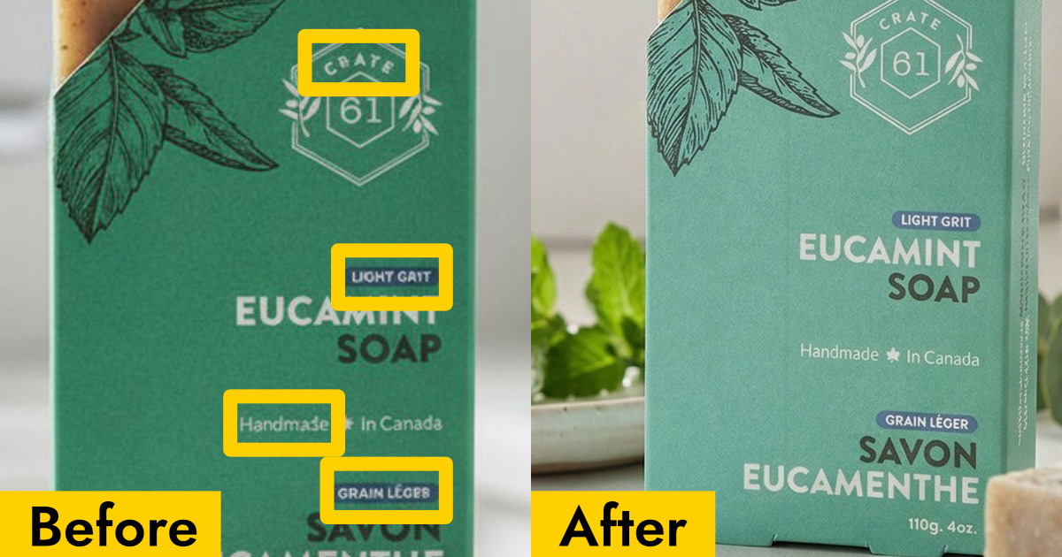
Why Your AI Product Photos Keep Getting the Text Wrong (and How to Fix It)
AI image generators often garble text on products. Learn how Pebblely automatically extracts and preserves text on labels, packaging, and branding.

10 AI Product Photography Prompts That Work
Struggling with AI product photo prompts? These 10 tested prompts generate beautiful, realistic product images every time.
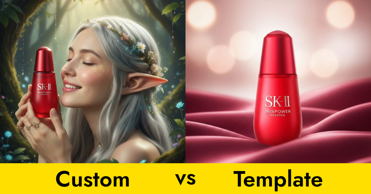
Custom Prompts vs Templates: Which Should You Use?
Pebblely offers two ways to generate product photos: templates and custom prompts. Here's when to use each for the best results.